August 23, 2025
Why Average House Prices Can Mislead
Average house prices in Mayfair (W1K) spiked in 2025 after a £385m sale. Discover why averages mislead and how 90th percentile, top 5% and outlier markers reveal the real story in London’s prime property market.

If you’ve spent more than ten minutes reading property news, you’ll have seen the phrase “average house prices are up X%”. Sounds simple. But averages can hide more than they reveal — especially in London’s prime postcodes.
Take W1K (Mayfair). In 2025, the average sale price suddenly rocketed to over £40 million. Did every flat and townhouse in Mayfair really quadruple in value overnight?
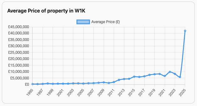
Not quite. What actually happened was that one single sale — a monster transaction at £385 million — dragged the average skywards.
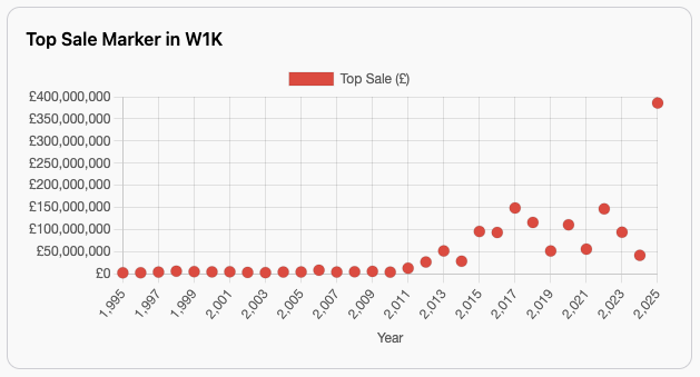
That’s the problem with averages. Outliers easily skew them. If you’ve got 645 homes selling for around £2m, and one mega-mansion at £385m, the “average” is meaningless to 99% of buyers and sellers.
Cause and effect?
The issue stems from the Land Registry dataset. It simply and rightly lists every sale of residential property. But not all sales are the same. In the case of the £385m sale in W1K above, this was not a standard transaction; that is, an individual buying a home, but rather the sale or transfer of an entire building. The data set does provide some help on this. PPDCategoryType is a field in the Land Registry data. It's either A or B.
- Category A - Transfers under a single title number for a single residential property. The price stated is a genuine open market value where the transaction is at arm's length.
- Category B - These transfers could be transfers of a block, repossession, block sale of a BTL portfolio, transfers between companies, sales that do not reflect true market value and so on. They are perfectly valid sales, but as they don't reflect sales at arm's length, they can and do distort the market.
What was happening with my initial data was that the distortion as a result of those category B sales suggested the average price in W1K had shot up to £45m. Not true.
Partial solution - remove category B Sales
The first and most sensible approach is to remove Category B sales from the data. I should have realised this first time around!
What is important when looking at property data and trends that matter to buyers, sellers, and people like me, understanding trends is that you need to reflect on true sales. That is sales that reflect what is happening in the market, people buying properties, not transfers, block sales and so on.
So that is what I have done, removed category B sales from the data to prevent distortion. Take another look at W1K with Category B sales.
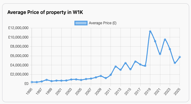
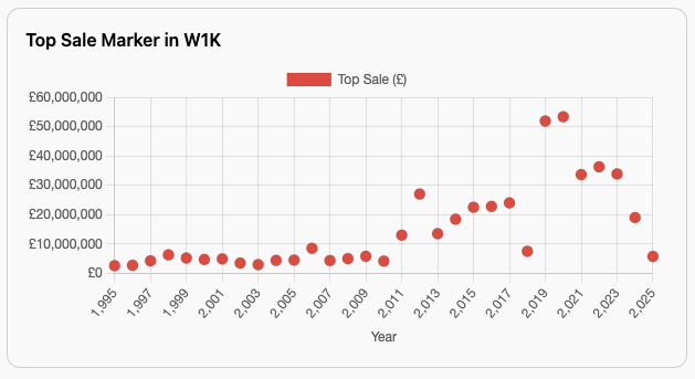
Now there is a significant difference. All that is being reflected is true arms-length transactions. But there are still outliers which distort the average.
Adding additional clarity
Especially in Prime and Ultra Prime London locations, distortions are still evident even after Category B transactions are removed. There will always be outliers in these areas. In fact, there will always be outliers in every region, just that some London sales can cause a more significant distortion.
For Prime and Ultra data, I have added some additional clarity to the data. The purpose is to smooth out the views, add context and separate the top sales whilst demonstrating whether these are out of kilter with the rest of the market in that particular area.
For each Prime and Ultra postcode, there is a new view.
90th Percentile
For those who are interested but don't fully get this viewpoint.
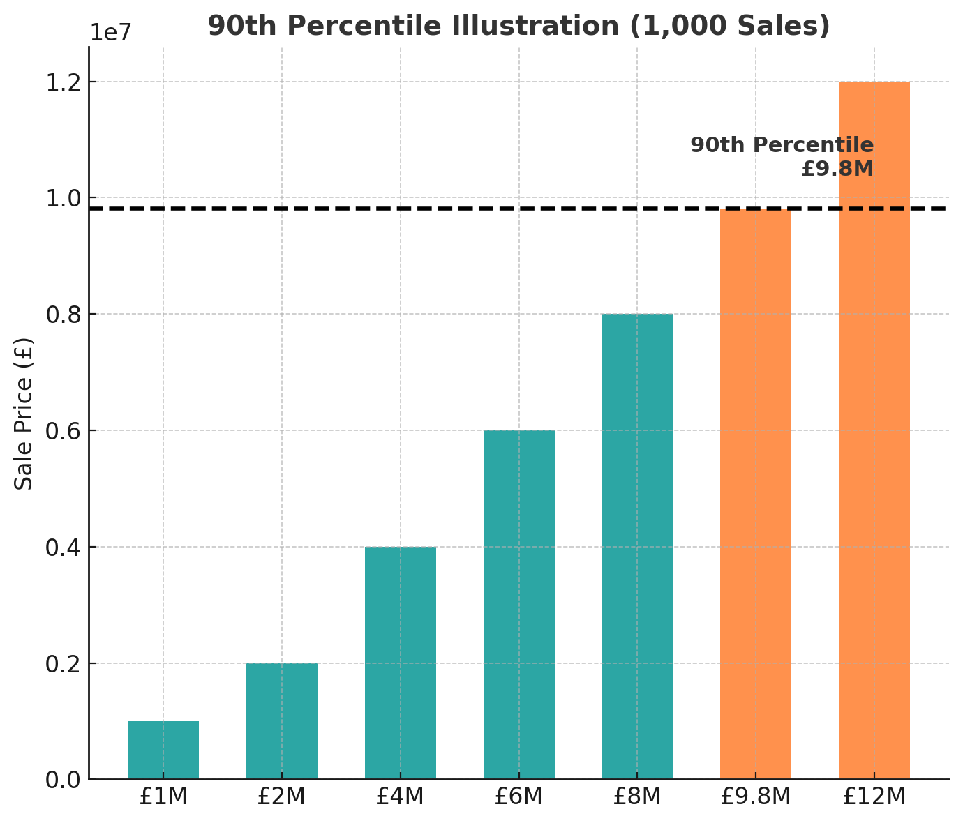
In the chart above, the bars show example property prices for one area. Imagine there were 1,000 property sales in that district:
- First, line them all up from the cheapest to the most expensive.
- Then, find the price of the 900th sale in that list.
- That price – £9.8m in this example – is the 90th percentile.
What this means:
- 90% of homes sold for less than £9.8m
- Only 10% of homes sold for more than £9.8m
So the 90th percentile gives us a clear cut-off point for the “top end” of the market. It’s different from the average, which can be skewed by a few very high sales. Here, we can see both: the average for the overall market, and the 90th percentile to highlight the ultra/prime-expensive tier.
On the new view 90th percentile is displayed as a line.
top 5% sales average
To take the crème de la crème of transactions and average them out, so you can see luxury market trends clearly. This is now a line on the new view.
Top sales marker
A new scatter dot chart for the highest sale each year has been included. Hover over it, and you get the top 3 transactions for that year with prices, dates and postcodes. That’s how I caught the £385m sale in 2025. This now lets you see what the outliers are.
Finally, look at the new view in W1K
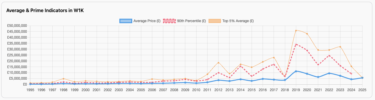
Hopefully, this makes the position much clearer.
- The average price is the average price, everything across the whole of W1K.
- The 90th Percentile shows the threshold into the top 10%. If it's relatively flat, then that entry point is not moving drastically, as it was with Category B sales included.
- The top 5% is an average for the going rate at the very top range for property in W1K.
Why this matters
Most property commentary is based on averages, but as you’ve just seen, they don’t tell the full story. The average line on my chart for W1K went vertical in 2025 — but the 90th percentile and top 5% average stayed flat. In other words, the market didn’t move (much). One outlier did.
Without removing category B and those extra charts, you’d think Mayfair had suddenly become unaffordable even by oligarch standards.
The takeaway
Averages are fine for showing overall market value, but if you want to understand what’s really happening, you need more context. Percentiles and outlier markers give you that.


Comments (0)
Want to comment on this page? Login or Register.